Pages

Wednesday, October 30, 2013

Hey Everyone! Happy "Hump" Day!! And Halloween is tomorrow and I can't wait! In honor of this most creepiest of holidays, I made a ZOMBIES! Halloween tag. This project just came together pretty quickly, you could say I was possessed at the time of its creation. Check out the pic if you dare:

 
What do you think? I think a Zombie would be thrilled to have this. Just attach to a gift box or a jar of brains and give it to that special Zombie in your life. Now what I did to create this tag was simple. But your Zombie doesn't have to know that. I just took a standard tag and inked the entire surface with a purple inkpad. I then took a stamp that hubby made for me and inked the background pattern with Staz-On jet black ink. I tore two pieces of the green striped paper and inked that with black and glued it to opposite corners. I used my white gel pen to add faux stitching.  It gives it that just operated look, which is in right now.
 
 Now for the zombie, I freehanded the shape and used my X-acto knife to cut it out. I glued it to a piece of chipboard, and clear embossed it. For the exposed brains effect, I used a Staedtler Fine Point pen in Red and my white gel pen. I love this effect! In person it really has that exposed brains look that all zombies are trying to achieve this fall. I also used the red pen to draw creepy blood trails and drips. Since I embossed the surface, the red and white pens stand out against the silhouette I made. With the negative space left over from cutting out the shape, I used it as a stencil to add more creepiness. To finish it off I wrote Zombies! on the tag in black and red pens and added more faux stitching. And ta-da!, my Zombie tag is complete.
 
I hope you all enjoyed this project. I had a spooky time creating it. I will end this post here but hold on.....


Sorry, some Zombie was knocking on my door asking for "Barbara". I sent him next door to my neighbor's. Enjoy the rest of your day and Peace!

Tuesday, October 29, 2013

Hey Everyone! Happy Tuesday to all! Man, I have to say that this past weekend was the busiest weekend I have ever had. Friday we took the girls to the annual pumpkin patch in our neighborhood. Then Saturday, we went to the Halloween party at the bowling alley. Unfortunately, my girls did not win the bowling pin contest. But we got to keep their entries and I now have them proudly displayed in my crafting area. Then Sunday, I spent the day in the ER cause I wasn't feeling well and had to stay overnight for observation. Luckily, they sent me home yesterday. It was some kind of bug going around. But I'm feeling alot better. Well enough about my weekend, I was able to finish my Halloween treat boxes I made for my girls. I got the idea for these from YouTube and they were simple to make. The only part I found to be the trickiest was making the actual top for the box. Other than that, I think I'll make some more for Christmas and see how I can improve the whole box top making process. But here are the pics for your perusal:

 
Aren't they cute? My daughters love them! I just need to add treats and sneak a few. These boxes were made using two 8 1/2 x 11" sheets of patterned cardstock. I used The ColorBok"Chateau Noir" stack. I've used this stack for alot of projects that I have featured on this blog. The papers are beautiful and versatile.
Now for the boxes, you score the 8 1/2 x 11 sheet of cardstock at 2 1/2, 5, 7 1/2, and 10" horizontally. You then score it at 2 1/2 " vertically. Cut off one corner and then cut up the score lines from the bottom. Fold along the score lines and either glue or add sticky tape to form your box shape. For the bottom, you just fold it in on itself and adhere.
 
For the top of the box, I cut a 3 1/2 x 3 1/2" square. I turned the box upside down and laid it on the square. I then marked the opening of the box on the square and scored a 1/4' from that line. Now you cut up along the score lines at the corners. And make sure you trim a little off each corner to cut down on extra bulk. Fold along the score lines, tuck in and glue the corners. With this part I had to go back and forth measuring and remeasuring the square to ensure a snug fit. Everything else was pretty simple but making the box top was challenging. You could also opt to leave the box as is without a top. Once finished, just add tissue paper and treats.

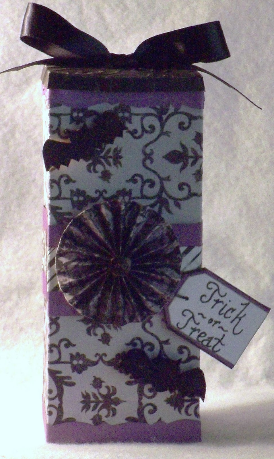
You could leave the box as is but I added a few embellishments to make these more unique. Here's the one I did for my five year old:

 
 I added a black satin ribbon tied in a bow to the top. I cut two 2" purple strips with decorative scissors and adhered it to the top and bottom. I also added a 2" purple strip layered with a patterned paper to the middle. The addition of a rosette, hand cut bats that were embossed and a handwritten tag completes the look. And ta-da, treat box numero uno is ready for candy.
 
Now for treat box numero dos that I made for my fourteen year old, I used some of the same embellishments but switched the placement.
 
 
 The rosette was added to the top. I used green and gray patterned papers for the middle, top and bottom. I added a black satin skull ribbon that was purchased from Michael's last Halloween. Skull and crossbones cut from my Cricut that I embossed and a tag. And voila, that completes treat box number two.
 
 
And there you have it. Halloween treat boxes perfect for those little goblins in my life. I hope you all enjoyed this project. It was fun to make as well as challenging. But I will definitely be making a few more for different occassions. I will end this post here and hope you all enjoy the rest of your day and Peace! :)

Saturday, October 26, 2013

Upcoming Projects...

Hey Everyone! Happy T.G.I.F!!!!!!!! Yeah, I'm so glad that it's finally here! :) Halloween is next week and I have been watching all kinds of ghost hunting shows to get myself into a spooky mood. Today we took our daughters to the annual pumpkin patch in our neighborhood. It was really nice and the girls had a ball. That is till my five year old saw all the people in costumes. Someone dressed as the Incredible Hulk passed by her and she totally freaked. Let's just say there were tears, screams, panic, and running. We were able to calm her down and explain to her that Halloween is all about fun and dressing up. She was happy with that explanation and was able to enjoy the festivities.  With an occassional closing of the eyes when someone spooky walked by. Poor baby!

Well enough about my night. I have a few more Halloween projects I'll be working on over the weekend. I have a treat box I'm making for the girls plus a spooky tag. If all goes well , I should be able to post these next week. So I hope you stay tuned for that. I also have the fifth page in my album to work on and I'm brainstorming ideas for Thanksgiving. Time just seems to be flying by. Christmas is only 2 months away! I'll stop here before I start hyperventilating. I think this a good stopping point for this post. I hope you all enjoy your T.G.I.F and Peace! :)

Thursday, October 24, 2013

Fourh Page... Done!

Hey Everyone! Happy Thursday to you all! Can't believe it but my favorite day is almost here! To celebrate, I was able to finish the fourth page in my paper bag album series. Originally, this page was done over the weekend. All it needed was a coordinating tag. I took it out to adhere to the album and thought "Man, what was I thinking when I made this?!" I'm sure I'm not the only one this has happened to. I'm sure we have all done a project and thought it was awesome . Then looking at it days later you wonder "Did my brain take a leave of absence? I certainly don't remember making this?" That was the feeling I got when I saw the original page. I decided to redo it with different papers and embellishments and was pleased with the final result. I only wish I didn't destroy the original, I could've added the pic into this post. I have to remember that for next time. But here's the pic of the page fully remastered:

 
Voila! What you see is a 5 x 10 page in hues of pinks, blues and greens. I love these colors together! I like to think of them as Happy Colors! Keep in mind, I'm still using the ColorBok stack for this album. It's just a matter of mixing and matching papers to achieve a different look. The base is pink but I added a border I made from different papers to the top. The sentiment "Happy Thoughts" I cut from a patterned sheet and attached to a pink background. I layered the sentiment on top of each other to make it fit the page. I also inked the edges and added flowers I cut for added interest. In the right hand corner, you see some more of those paint chip banners which I can't get enough of.
 
Going down to the photo mat, I used a blue patterned paper for that and attached it to the same pink paper as the sentiment. With the addition of the chipboard pieces on the left, it gives the mat added texture. I customized these pieces myself with papers from the stack. I used Crystal Effects and Stickles to make them stand out. On the lower left, I placed a few more paint chip banners and added a homemade wreath. This wreath was made using a metal shower curtain ring. I just wrapped it in pink satin ribbon, added cut flowers and punched leaves. For the bow, I glued it directly to the page above the wreath using that same pink satin ribbon. I LOVE how this wreath came out and it really gives the page that extra OOMPF! I LOVE how this page turned out so much better than the original!
 
I also made another double-sided tag to go along with it and here are the pics for that:
 
 
Just added the same border as the page to the bottom.
 
 
Finishing touch is the pink ribbon.
 
 
And there you have it! The fourth page remastered is complete! I hope you enjoyed this project. It was a challenge starting from scratch but the result speaks for itself. I will end this post here and wish everyone a Good Night and Peace! :)


Wednesday, October 23, 2013

Hey Everyone! Happy HUMP Day!!! Only two days left till the start of the weekend and I can't wait! For today's post I have a fall card I made yesterday. There's a Make It Monday Challenge going on over at thememorynest.com.  The challenge is to make a layout or card using the colors of fall. I checked out the other projects done by the design team and it definitely inspired me to create this card. All of the projects featured I thought were beautiful. Here's the pic of the card I made for this challenge:

 
I definitely challenged myself with this one. It's a standard A2 size card. The tree on the front was hand drawn, inked, and embossed on patterned brown paper.  I used a stylus prior to embossing to give it the look of bark. In person, this tree looks very realistic. Now for the grass, I freehanded that as well and adhered it to the front and inside of the card. The leaves were punched using a small leaf punch in the colors red, orange, yellow and brown. I inked and embossed those with a stylus for more realism. The leaves on the front and on the tree were just glued down. I cut around the tree and branches to expose the inside of the card for a 3D effect. I arranged the leaves on the inside to appear as if its falling off the tree. And for those I used popdots.
 
 
For the inside of the card, I inked the background in blue and orange to mimic the sky. I used my D'Vine Swirls embossing folder and white gel pen to make it seem like a cloud filled sky. The sentiment "Hello" was stamped in brown, red, orange and yellow inks for an ombre effect. I then embossed it and cut out the letters to arrange them as if they're falling. It adds a nice touch to the overall effect of the card. And that's that.
 
I really love this card and how it turned out. It was fun coming up with the design and putting it together. I hope you enjoyed this project and stay tuned for the next page in the paper bag album series. I will end this post here, my caffeine-o-meter is dangerously low and needs refueling. Enjoy the rest of your evening and Peace! :)


Tuesday, October 22, 2013

Third Page...Complete!

Hey Everyone! Happy Tuesday! Hope you're having a great start to your week. I finally have the third page in my paper bag album series COMPLETED! It feels like it took me forever to get it done, but I was able to put the finishing touches on it last night. Here are the pics:

 
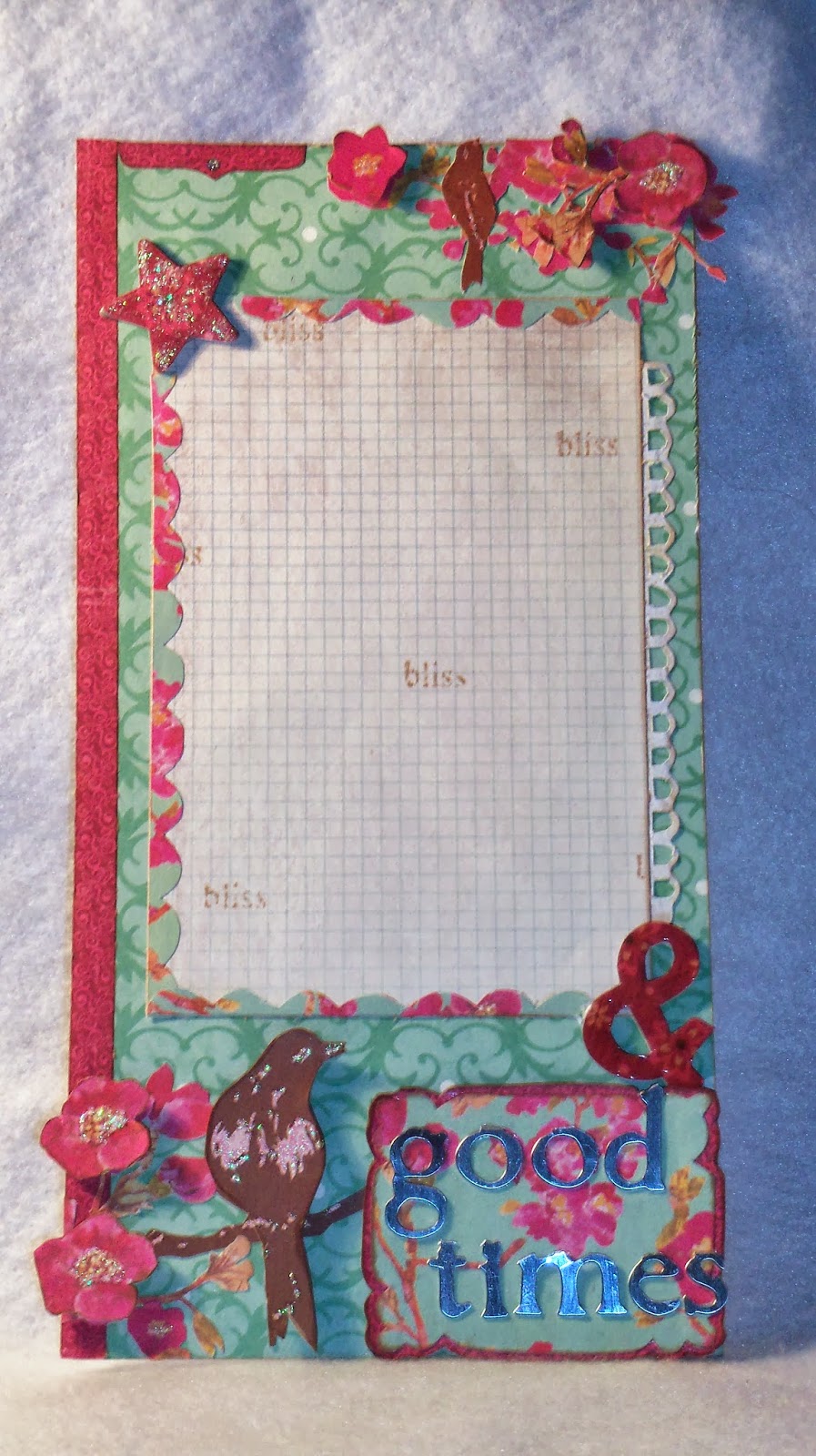
I really like the way this came out. The colors work beautifully together and its very pleasing to the eye when you see it in person. For this page, I used alot of the same techniques I used to create the cover and adjoining page. The background is a teal paper that I glued branches and flowers to, to create my own pattern. I then cut a few matching pieces and used pop dots for a 3D effect. For the birds, I just cut them out from a yellow patterned paper in the stack. The bird on the lower left corner I pop dotted and then added stickles for more dimension. The smaller bird in the upper right, I just glued directly to the page. 
 
 
Now for the 4x6 photo mat, I added a scallop border, chipboard embellishments (that I made) and some stamping. The border on the other side of the mat looks like torn notebook paper, but, it's a lace border I cut from another sheet. I just inked it, like everything else, and cut out the holes in between. It really gives it a nice look.
 
The decorative embellishment at the bottom of the page is just more patterned paper. I cut and layered the two pieces together, used pop dots, and added metal charms for the "Good Times" sentiment. And ta-da, the page is complete.
 
I also made a double sided tag to go along with it and here are the pics for that:


Just cut the tag shape, glued patterned paper front and back, added more paper piecing and a ribbon. Done!
 
I hope you enjoyed this project. It was literally a labor of love to get it finished but I loved how it turned out. Before I end this post, my daughters have been working on a craft of their own over the weekend. It's for a contest at our local bowling alley. They had to paint a bowling pin. Here are the pics of their work:
 
 
Isn't it AWESOME?! This was done by my 14 year old. She went for a look that mimics the night sky. And here's the one my 5 year old did:
 
 
Believe it or not, she designed the look of this. Isn't it CUTE?! I am one proud mama!! I wish they could both win!
 
I hope you enjoyed these projects. I will let you know who wins come Saturday. I will end this post here for now and hope you all enjoy the rest of your day and Peace!


Sunday, October 20, 2013

Hey Everyone! Hope you're having a relaxing Sunday! This will be quick little post so I can get back to working on my paper bag album series. I made a cute halloween banner and the best part is it's magnetic. Here's the pic:

 
Isn't it cute?! It was really simple to make. I used orange cardstock that I cut into triangles measuring 2 1/2 x 4 1/4". The word "BOO" and the the trim were cut from a ColorBok stack I have called "Chateau Noir". I also used this paper in my "Something Wicked" scrapbook layout. I used an embosssing pen and Tim Holtz Distress Embossing Powder in Black Soot to make the letters black. This was my first time using this product and I love it. After heating the powder, you let it cool and then gently rub some of it off for a distressed look. I also stenciled a skull and crossbones design on the triangles using an orange inkpad.
 
Now the two black flags inbetween the triangles may look like cardstock but it's actually black bamboo bags. My husband bought a box of 200 from Ebay and said, "Here Honey. What can you make with these?. After the initial shock wore off, it came to me that I could use these for this Halloween banner. Now, I have to think of 198 more ways I can use these! Now, these bags are great for this project because they don't have a drawstring and they stay flat. I did not have to sew or glue them closed. I cut the skull and crossbones decorating the bags from a Cricut cartridge entitled "Over the Hill". I embossed them with clear embossing powder to give it a nice look and then inked around with a gray inkpad. I used the negative after removing the design as a stencil for the triangles. Great Tip for using those leftover pieces from your Cricut.
 
Finally, I made some rosettes and added black buttons to the centers. I used 1" wooden knobs painted black and black embroidery floss, to adhere the pieces and magnets. And, Voila my banner is complete.
 
This little beauty I have hanging on my fridge. I hope you enjoyed this quick little project. It was fun to make. I will end this post here so you can go back to enjoying your Sunday. Peace!


Friday, October 18, 2013

Hey Everyone! Happy F.R.I.D.A.Y!!!!! I'm doing my happy dance, typing, and getting weird looks from the cat and dog all at the same time! Isn't FRIDAY Awesome!! I have alot of things on my list that need to get done. I was supposed to do these things today but I got caught up watching " The World's Most Terrifying Places" on Hulu and that took up my whole day. Couch Potato syndrome strikes again. I was able to create a birthday card for my sister and here are the pics for that:

 
This card is your standard A2 size 4 1/4 x 5 1/2. The card base is white and the purple patterned paper is 4 x 5 1/4. I stamped this pattern on the paper myself using the Inkadinkado Garden Flowers stamp set. I just used a coordinating color inkpad to stamp the images. I cut out the purple and white cardstocks using a pattern I cut from my Cricut. I like the effect this gives cause it appears that the cake is stamped on the front but it's peeking through the inside. I added two paint chip banners and rhinestones to complete the look.


A pic of the inside of the card. The birthday cake I stamped, added Crystal Effects and watercolored it. I also pop dotted the cake for a 3D effect. A sheer silver ribbon tied into a bow and the inside of my card is done.
 
I hope you enjoyed this card I made. I had a blast making it. I also have a pic of the awesome stamp set I used. I'm not sure if you can still find it in stores but here's the pic of what it looks like:


 Got this set off Ebay and I absolutely love it. I have used this stamp set on a couple of my projects so far. Now, I haven't forgotten my paper bag album series and as of today, I still need to finish up the third page. So stay tuned for that. See my day wasn't completely lost to the TV. Enjoy your T.G.I.F., people and Peace! :)

Thursday, October 17, 2013

Paper Bag Album Page 2

Hey Everyone! Happy Thursday to you all! As promised, I have completed the second page to the paper bag album series. I pretty much used the same techniques as the cover but I added a double sided tag. This tag can be used to mat photos or for journaling. Here are the pics for your perusal:

 
There is alot of paper piecing going on, four papers to be exact. I chose a green background paper, then adhered flowers I cut from another sheet to create my own pattern. The smaller flowers I popped up for added dimension and I used the Crystal Effects in the center of the larger ones. The pink patterned paper was cut at 4 x 6. A border strip and paint chip banners complete the look. A top note piece and sentiment "Smile Discover" were both cut from the same sheet of paper and also added to act as photo corners. The ruffle at either corner of the top note embellishment was created from a rosette that went awry. I just cut it in half and glued it to the piece. The hardest part for me was figuring out which elements I wanted to use. But by paper piecing and mixing different patterns I created a one of a kind look. Don't be afraid to try this out for yourself. Just remember that you can mix and match papers from different collections to use for your projects.
 
 
This is the front of the tag I made. It's a sheet of white cardstock cut at 5x10 to which I glued a sheet of patterned paper ( I rushed through this step hence the wrinkling you see). I punched a hole at the top and threaded pink ribbon through it. I also added a smaller flower to the top for more interest. 
 
 
This is a pic of the other side of the tag. I only added three flowers to the bottom and another to the top . They can be used for more photos or for journaling. And that concludes the second page in this series.
 
I hope you enjoyed this project,  I had fun making it. I'll be working on the third page for this album tomorrow and hopefully I will have it up on the blog as well. I will end this post here, I'm in desperate need of caffeine and a carrot cake cupcake. YUM!! Enjoy the rest of your evening and Peace!


Wednesday, October 16, 2013

Paper Bag Album Cover

Hey Everyone! Happy Hump Day! Only a few days till the weekend and I can't wait! There's plenty of crafting to be done. I have a few birthday cards I need to make this week, as well as, my paper bag album and I'm also helping a friend design a one of a kind Hello Kitty b-day party. Plus, I have my mom stuff and housework, so you can see that my plate is pretty full. But ,since we women are so adept at multi-tasking, I'm sure I can get all this done with only a few meltdowns here and there. I was able to create the cover for my paper bag album sans meltdowns. My hope is I can do the other pages justice. Here's the pic of the cover:


I LOVE IT! The papers I purchased from my local Walmart really set the tone for the rest of the album to come. I used a ColorBok paper stack called "Delilah" to create the cover. This stack has alot of beautiful patterned papers in pinks, greens, blues and a few bold colors like red and yellow. It really is a beautiful collection! So, the next time you're at Walmart make sure you check out the paper. You might be surprised by what you find!
 
Now, I know what you're thinking. There's alot of complicated things going on here, I can't possibly do that. YOU CAN! Alot of what you see is a technique called Paper Piecing. Excluding the letters and rosettes, I used 3 papers from the stack and cut out the patterned circles, lace edge and flourish. The trick is to layer them to create the illusion of a single sheet of patterned paper. 
 
Once I had it all adhered down, I moved on to the rosettes. I cut three strips measuring 1 x 10" and scored every 1/4 ". You fold along the score lines back and forth all the way to the end, then glue the ends together. Quick Tip: Overlap the ends a little so that the folds meet up. It makes it a lot easier when you push down on it to form the rosette. There are alot of videos on YouTube showing how to make these. You need a circle, either punched or cut out, to adhere the rosette to to maintain its shape. For the middle of the rosette, I used chipboard circles and a lace heart to finish it off.
 
Now, for the chipboard letters. I got these from a Cosmo Cricket set my husband purchased for me at a local flea market. Its a western ABC set that I customized to fit my cover. I took papers from the stack, glued the chipboard letters and trimmed around it using my craft knife. I used Stickles on some of the letters and used Crystal Effects from StampinUp on the others. It's a great way to customize chipboard pieces and make them your own. I adhered the letters to the paper background with Glue Dots.  I think it adds texture and dimension to the cover.
 
Finally, the banners in the top right corner were made using paint chips. I picked them up when I purchased the paper. Just cut into banner shapes, stickle every other one, offset them, add rhinestones and then adhere. It adds another interesting element. And that completes the cover of my album.
 
Before I end this post (my hand is going to fall off from all this typing), I forgot to mention that the cover was cut at 5 x 10". With this measurement, I know that every page for this album will need to be cut at 5 x 10". It makes it easy to layer your pieces and get it looking the way you want it before you attach to the album. Also, I inked all the edges ,except the letters, in a light brown ink to give it a more shabby chic look.
 
I hope you all enjoyed this project, I had fun creating it. Stay tuned for more. I'll be starting the second page today and hopefully I can post it tomorrow. Enjoy the rest of your day and Peace!


Tuesday, October 15, 2013

"Pumpkin Pickin" Layout

Hey Everyone! Happy Tuesday! Hope you all are crafting up a storm. I have another 12 x 12 layout I did for another challenge over at CARDZ TV.  It's their CARDZ TV GO-TO GALZ LINKY PARTY CHALLENGE #6 "PUMPKIN PATCH" . Phew! Try saying that five times fast! I did this layout over the weekend and went a different route with the color scheme. Not your traditional Fall colors but it has a crisp feel. Here's the pic of the layout:


I went with blues, greens and orange for this page. I think the complimentary colors work very well together. The papers used all came from different ColorBok paper stacks. I used a green border I cut at 1 1/2"x 12" to fit the page end to end. I then used decorative scissors from Fiskars called Pisces to cut the edge. The sentiment "Pumpkin Pickin", I cut from a paper stack and just inked the edges in green and orange. I made a banner from embroidery floss and attached the letters Pumpkin to it.
 
The bottom layer of the page has 2 green borders I cut at 2". I freehanded the grassy edge and chalked them for added depth. The pumpkins I cut from Cricut Craft Room starting at 2" for the smaller ones and 3 1/2" for the larger ones. I used a brown color pencil for the lines on the pumpkins and then clear embossed them for a 3D effect. I adhered the first layer of grass to the page, then the pumpkins and then added the second layer of grass on top; to mimic pumpkins in a field.
 
I also added a photo mat that can accomodate a 4x6 photo. ( To be added later. If I can remember to print it out.) Now, for the interesting aspect of this layout. The banners that frame the photo mat and the pumpkin stems were all cut using paint chips. Paint chips? Yes, you read correctly. Those paint samples that you can get from almost anywhere they sell paint. I used those in varying colors of blue and green and added it to my layout. I think it gives it a different feel and is certainly an unexpected addition to the page.
 
*I forgot to mention that I added pastel green brads to every other letter in the Pumpkin banner*
 
And there you have it, a pumpkin layout using non traditional colors and paint chips. I had alot of fun making this page. The results speak for itself. I will definitely be stocking up on more paint samples to use on future projects. There are so many fun colors and the posssibilities are endless. 
 
I will end this post here. I hope to post the cover of my paper bag album tomorrow, once it's completed. I have a few other projects I'm brainstorming and I hope to post those soon. Enjoy the rest of your day and Peace!


Monday, October 14, 2013

Hey Everyone! Hope you all had a very crafty weekend! I spent mine putting up Halloween decorations with my youngest daughter, as well as finishing up another scrapbook layout and a tag. I also got started putting my paper bag album together and found tme to purchase some awesome papers to decorate it. I decided that for the paper bag album , I will post pics as I start to decorate and embellish, so you can see the process from start to finish. I want to take my time with this album and not rush it. Luckily, I had all my fave shows to catch up on from yesterday. Including "The Walking Dead" which premiered last night! LOVE this show! Although it can be pretty gruesome and I definitely do not eat while I watch it. Enough about ZOMBIES, here are the pics from my latest christmas tag I did over the weekend:

 
I made this tag the same way I did the red and green tags. (Scroll through my previous posts to see how I made those). I inked the tag with a blue inkpad but instead of using my heat tool to dry it, I let it dry overnight. Great tip if you're not in a rush to make these. I used a christmas stamp set from Inkadinkado and stamped both the flourish and the sentiment in Versamark.  I used a Heat and Stick powder and sprinkled it over the image and heated it till it got sticky. But instead of using silver embossing powder, (which I do not have), I used silver glitter. Just use your heat tool to set the glitter as you would for regular embossing. Be careful not to heat it for too long. The Heat and Stick powder helps to hold the glitter in place so it doesn't flake off as easily. I added a coordinating ribbon and matching cardstock to the back and Voila!


I really love the colors of blue and silver together for the holidays. This tag was pretty simple to make and took no time at all to complete. I really enjoyed making it. I will probably do a few more to see how many variations I can get.

Now for the paper bag album I'm starting, here is the pic for that:


I just took regular paper lunch bags, 5 of them to form this album. I got the idea from YouTube where there are a lot of tutorials on how to do this. Hardest part for me was actually attaching the bags to each other to form this album. I hope I can make this album the way I have it pictured in my head but we'll see how it goes from here. So stay tuned, I will post pics daily as this album progresses so you can see it from start to finish.

I hope you all enjoyed the tag I made. I will end this post here, I need to get my youngest daughter from the bus stop. Where has the day gone? We all know what day of the week it is I just don't like to mention it in my post. Garfield moment all over again. Enjoy the rest of your day and Peace!


<br />
<div class="The-Memory-Nest-button" style="width: 200px; margin: 0 auto;">
<a href="http://www.thememorynest.com"><br />
<img src=" https://lh3.googleusercontent.com/-ZakoHcRrQ0g/UindlvmmhKI/AAAAAAAAFi8/iPbG01BE0XY/w200-h150-no/Blinkieframe.gif" alt="The Memory Nest" width="200" height="150" /><br />
</a><br />
</div>
<!--end button code box--><br />


Friday, October 11, 2013

Hey Everyone! You all know what day of the week it is... F.R.I.D.A.Y! I'm doing my happy dance as I type this. Multi-Tasking! I also completed a project for an Ombre Challenge over at thememorynest.com.  This was their Make It Monday Challenge that's going on now thru the end of October. I checked out the inspiration projects the design team made and they were all lovely. I made a birthday card and I love the way it turned out. Here are the pics for your perusal:

 
At first I thought I had this challenge in hand but it proved to be trickier than I thought. Finding colors for this technique was hard. I must have tried 3 or 4 different color combos before I settled on the purple. After achieving the level of color I wanted, I inked the entire layer in versamark and heat embossed using a clear powder. In person, the layer has a glossy effect further intensifying the colors. Since the ombre layer is the star of the card, I kept the rest of it pretty neutral. I stamped the birthday cake, sentiment and border in Staz-on Jet Black ink  I also added stickles to the birthday cake to make it sparkly. A few rhinestones adhered to the flag sentiment completes the look. And Voila!


Side view. Forgot to mention that the cake is pop dotted onto the ombre layer for dimension. Border layer was hubby's idea. Thanks babe!
 
 
What can I say? I definitely challenged myself with this one. I find that the ones we think are the easiest are in fact the most cahllenging. But I really enjoyed making it and love the final result. It's nice when we can challenge ourselves, whether it's in crafting or life in general. I hope you all enjoyed this project. I had fun making it. Stay tuned for another christmas tag I will be doing this weekend and possibly my first ever paper bag album. Oh mama! Well, I will end this post here, I completely forgot I still need to get dinner on the table and the natives are hungry! So enjoy your T.G.I.F and Peace! 


Thursday, October 10, 2013

Countdown to Weekend Bliss Begins

Hey Everyone! Happy Thursday to all! The weekend is almost here and I can't wait! I'm looking forward to sleeping in for an extra hour or two. If you're a parent, you know that sleep is a commodity that's hard to come by. So I relish the thought of the week finally coming to a close so I can rest. I also get to stay up a little later and craft till I can't craft no more. While I begin the countdown to weekend bliss in my head, I finished the Halloween layout I mentioned in yesterday's post. Here are the pics:


I love the look of this page. It's monochromatic with the black and white patterned paper, but the touches of orange throughout the page makes it pop. It has a folk art type of feel. It has the title, photo mat (to which a photo will be added later. Once I stop hoarding them on my computer) and the banners can be used for journaling. The hardest part for me with this layout was the medallion shape I cut out of the orange and patterned papers. I got the stencil from the mag I mentioned a few posts back.  Getting them to line up so they would fit nicely on the page was CHALLENGING! But I was able to make it work to achieve the final look.


A side view pic of the page.


 This witch came from the Better Homes and Gardens mag I bought. This stencil was meant to be enlarged and embroidered on a pillow. But I used the stencil as is and paper pieced her together. I added some paper rosettes I made to decorate her dress and stickled them.Some faux stitching and a crow on her shoulder completes the look.


I added these three pumpkins I got from the Cricut Craft room. They were cut at 2" but I freehanded smaller ones to fit the page. I cut the stems from each one and reattached them. The black and orange pumpkins have faux stitching and the patterned one has stickles. I added a spider with wire legs to the pumpkins for a 3D effect. Making the spider actually skivved me out and I am sure I will never make it again. I am a card carrying member to the arachnophobia society! Cool effect but creepy.


Side Note: I made faux chipboard pieces out of the witch and pumpkins. It's a great technique for images but not for lettering.


The title of the page I made using letters I cut from a ColorBok paper stack "Chateau Noir". I thought it fit in with page quite nicely. I adhered them to orange cardstock I cut into banners. As you can see there are two more spiders framing the title.

I enjoyed making this layout and hope you do as well. I have a few more projects that I'm working on and hopefully I can post those soon.

I will end this post here and hope you all enjoy the rest of your day! Peace!


Wednesday, October 9, 2013

Upcoming Projects

Hey Everyone! Hope you all had an Awesome Hump Day! I felt like the day went way too fast for me. I have been busy all day! Considering that Wednesday is my lightest cleaning day. I wanted to post earlier but I just couldn't find the time. I will say that I am working on a few projects to post for this week (Hopefully!?). I was looking through my oldest daughter's scrapbook the other day and gasped. I have only ever done 1 Halloween layout! I couldn't believe it. So one of the projects I've been working on for the better part of the day is a Halloween layout. I like how it's looking so far and I hope I can be done by tomorrow for posting.

Hmmm, I can't think of anything more to add to this post, so I will end it here. This has got to be the shortest entry I've made since starting this blog. I think everything I did today is finally catching up to me. So stay tuned. Enjoy the rest of your evening or morning ( depending on your part of the world) and Peace!

Tuesday, October 8, 2013

Hey Everyone! Hope you are having a great start to your Tuesday! I finally got my camera working again and I was able to take pics of the project I made for Breast Cancer Awareness. I think it's time for an upgrade on my camera. It seems like every week there's a problem. I've been pretty good this year, so maybe Santa will take pity on me and get me a new one. Well before I get too far off topic here are the pics:


I went a diffrent route with this. Initially I was going to make a card. But I figured that the majority of entries would also be cards. I thought a tag with an original poem would be a better choice. So just like with my christmas tags, I used a standard manila hang tag. I inked the front of it and did some stamping and embossing. The bird and flower stamps are from an Inkadinkado stamp lot I won on Ebay. I got this stamp and 10 others for $5.00 + free shipping.  Thank You Ebay! :) To achieve that darker pink on the images, I stamped it in Versamark and then embossed with a clear powder. I also added rhinestones, doodling and stenciled lettering. The pink doily flower I added afterwards to give it interest. Oh, I forgot the pink ribbon,  I drew it freehand, inked and embossed it as well. I only added glue to the middle of it and curled the ends for a 3D effect.

 
This is a pic of the back of the tag with the poem I came up with. Now, the front of tag was the easiest part but the back was more difficult. I initially went with white and used a heart doily to stencil hearts on top of it in pink. But I didn't like the look of it. So my hubby suggested I use the same pink as the front and add the flower doilies to tie it together. I had to agree with hubby, it definitely unified the front and back. The poem I printed of my computer and inked it.
 
Here is what the poem says:
 
"This is for the women
Fighting for their lives
In the ring".
This is for the loved ones
On the sidelines.
Cheering them on and
Mopping their brows.
And this is for those who lost
The fight in the final round.
I dedicate this to you all
And pray you will continue to
"FIGHT FOR THE CURE"'.
 
 
I love how this tag came out. It wasn't easy and I had to make changes here and there, but I love the final result. I hope you do too.
 
I will end this post here. I have chores that need to get done. We all know how that is.
Enjoy the rest of your day and Peace!


Monday, October 7, 2013

Hey Everyone! I hope you all had a very relaxing Sunday. I spent mine finishing up my entry for the Cardztv.com Breast Cancer Awareness challenge. I love the way the project turned out and tomorrow I will post the pics. But for today's post, I finally have the pics of the Christmas tags I did last week. I've been hyping them up in a couple of my posts. I just haven't had the time to post them .  But without further ado, here are the pics:


This is the "Joy" tag I made. I inked a manila tag (5 1/4 x 2 5/8) with a red inkpad and dried it using my heat tool. I would've painted it but I'm impatient. Plus with paint you can overdo it. With the inkpad you can control the level of saturation by the amount of pressure you use. Finally, you stamp and emboss with gold embossing powder and heat set it. I used gold embroidery floss (which I added after this pic was taken) to finish it off. I think it makes for a more elegant looking tag.


I liked the red so much I did this green one. I did the exact same thing as the red, just changed the stamp and inkpad color. I also added gold embroidery floss, which was done after this pic was taken. I will say that when I used the heat tool to emboss these tags, they curled alot. I put them between the pages of a book and weighed them down. I also added cardstock to the backs of them for more stability.
 
 
I like the howthese tags turned out and I had alot of fun making them. They're pretty straightforward and easy to do. I'm thinking of making a blue and silver tag to go along with the green and red.
 
I will end this post here, it's almost that time for me to pick up my 5 year old from the bus stop.
 
Enjoy the rest of your day ( unfortunately I don't want to mention the what dayof the week it is cause I'm having a Garfield moment) and Peace!


Sunday, October 6, 2013

Hey Everyone! Hope your Saturday was awesome! I've spent my Saturday working on a project for Breast Cancer. There is a challenge going on over at CardzTV .com  to create a layout, card or craft for Breast Cancer. I figured I'd throw my hat into the ring for this first challenge. For the better part of the day, I've shed tears, sweat and brain cells trying to come up with an original design for this. I think I might have something worth entering. Its partly finished but I had to step away from it for now to give myself time to replenish my creative juices. Once I have completed the  project, I will post the pics.

Cancer has touched my life as I'm sure it has with you all. My mom was diagnosed with Multiple Myeloma back in 2007. Multiple Myeloma is characterized as a blood cancer that affects the bone marrow and over time weakens the bones making them brittle. When she was diagnosed, it was a shock for my family. Not much is known about this type of cancer and until she was diagnosed I had no idea it existed.  My sisters and I had to research to learn more about it and what treatments were being used to combat it. For months, my mom was confined to her bed unable to move cause the pain was so excruciating. When we did get her to see an oncologist after her diagnosis, she was hospitalized immediately for treatment. The worst part of it for me other than her diagnosis and hospitalization, was when she had a sample of her bone marrow taken. For those of you who aren't familiar with this procedure, they extract a sample from your hip bone. I almost fainted when I saw the insruments used. I had to wait out in the hallway till the doctor was done. My sister at the time was pregnant and was able to hold her own and give her support.

 I asked my mom about the experience later on and she told me that she doesn't remember having the biopsy done because of the amount of pain she was in. My mom spent a week or two at the hospital, if memory serves me right, where she was put into a sleep induced coma because of the amount of pain she had. Once the pain was managed, she was moved to a hospice facility. I can say that I hated that place. I felt she really didn't belong there and I felt that she wasn't given the care she needed. While she was there she caught pneumonia from the patient next to her and had to be sent back to the hospital to be treated. But after she was treated, she was moved to a physical therapy center, where she was able to get back some range of motion. I can say it was very hard for me to sit back and watch a woman who was so full of life not be able to anything without someone to help her. I'm sure for those who are experiencing this situation themselves you know how heartbreaking it is.

But, to finish up this blog before it gets too late, I will tell you that after a round of chemo, a stem cell transplant, and monthly intravenous treatments to help strengthen her bones, my mom has been cancer free for about 3 years. That number may be off, but chalk it up to those burnt brain cells I fried earlier in the day. Writing about my experience today has been good therapy for me. Alot of what happened during the time of my mother's illness, I pretty much stored it away in the back of mind. This is honestly the first time I have spoken about it since it happened.

I"m happy I was able to share my story with you and I pray that one day there can be a cure for cancers like Breast Cancer and Multiple Myeloma, so others won't have to go through this experience. I'll finish this post on that note and I"ll say Enjoy the rest of your evening or morning, depending on where you live and Peace!


Friday, October 4, 2013

Hey Everyone! It's F.R.I.D.A.Y, People! The weekend is almost here and that means a chance to try new things and get crafty. My weekend started early cause the kids were off from school. In Louisiana,  they get a day off for the fair that's going on this week. When I spoke to my mom yesterday, she asked me if they also get Columbus Day off too. I said no and she replied," I guess they don't believe Columbus discovered America down there". When she said that I couldn't help but laugh. My mom is pretty awesome and her and I share the same kind of humor.

Now in my last post I promised some pics of some more christmas tags I've made. But I also did a craft project for Halloween per the suggestion of my sis. Thanks sis!  Here is what I came up with and I'm proud to say it was all me. I think I deserve a cookie for that. Just Kidding. Here's the pics:

 
I LOVE how this frame came out. I used a shadow box my hubby got from a yard sale. I printed an excerpt of "The Raven" poem from my computer.  I dipped it in coffee and dried it with my heat tool to achieve an aged look. I also tore the edges and inked them with a brown ink pad. This shadow box did not have a back piece, so I macgyvered it using a back piece from another frame and glued the excerpt to it.
I did not smooth the paper down as I glued it. I felt it added alot of texture and interest.
 
 
The title I cut from a ColorBok paper stack that included lettering. I glued only half of the letters to the frame to give it a 3D effect.
 
 
Thr tombstone I cut from my Cricut using the Over The Hill cartridge. I freehanded the RIP in the middle and then cut out the negative space surrounding the letters. I also used a stardust gel pen to color it in. I did some chalking and doodling to give the appearance of stone. ( I also did this technique to the Nevermore letters.)


Now the piece de resistance, is this AWESOME RAVEN framing the corner.
The raven came from my local Dollar General. It's a silhouette we used for Halloween window decorations. It comes in a pack and I took three of them and glued it together. I added embossing and doodling to achieve the look of feathers. And I colored in the eye using a white gel pen and a black rhinestone to make it look realistic. CAW!
 
 This frame makes an awesome addition to any halloween decor. You can also keep it displayed all year long or give it to an Edgar Allan Poe Fan, like myself. But I promised my 14 year old, she could display it in her room. She Loves Edgar Allan Poe as much as I do.
 
This project took no time at all and I pretty much had everything I needed to make this. Would I make another one like this? The answer is YES! As long as I don't have to make it with SPIDERS! They really crteep me out!!!!
 
So I hope you enjoyed this project. I had alot of fun creating it. Tomorrow I will post the christmas tags I made. And give you all the details on how I did it.
 
Enjoy the rest of your F.R.I.D.A.Y, people and Peace!


Thursday, October 3, 2013

Hey Everyone! Hope you all had a Great Thursday! My Thursday was pretty good! I finished that "Work in Progress" scrapbook layout I started in the beginning of the week. And I also had time to make a few more christmas tags. So suffice it to say it was a very productive day. I even watched a few episodes of one my favorite shows, " Nashville". I don't really listen to country music but I Love, Love the show.

 Here are pics of the finished layout I did:


I like the way this page turned out. I showcased a variety of techniques to achieve this look.
There's stamping, rhinestones, doodling, die cut elements, embroidery floss, and some faux chipboard lettering. I like the color scheme of blue, green and brown and feel that they work well together. But I feel like it needed something more.


This pic is a close up photo of the title. The sentiment "Butterfly Kisses" I cut out of my Cricut from the George and Basic Shapes Font cartridge. I glued down the letters to an empty box and cut them out using my craft knife. This part of the layout I found time consuming. It took me a while to cut out each letter and in the end, the result is ok. I found the idea for the faux chipboard on YouTube. Would I do it again? Probably not. I think in this instance it"s probably cheaper to buy chipboard letters. The mat behind the letters I had to stamp twice cause I smeared it the first time. I did add 3d stamped butterflies, some rhinestones and doodling to complete the look.

 
Here is a side view of the page. To adhere all my layers, I use my ATG gun and Scotch Quick Dry adhesive. I love using my ATG gun, but if you're gonna make 12x12 layouts all the time you will run out of tape quickly. My husband was able to get me 6 rolls of adhesive for a good price on Ebay. I've also heard that framingsupplies.com has good deals on adhesive as well.
I do recommend the Scotch adhesive. It dries quickly and has a good strong bond.
 
I wish I would've used a fourth color on this page. I feel that in some areas it needed something bright. It gets a little dark and matchy matchy in some places. But lesson learned. I think I will try doing this page again with a different color scheme and minus the faux chipboard.
 
That's the beauty of crafting. There really is no right or wrong way to do things, it's whatever is pleasing to the eye. In the end, our own worst critic is ourselves.
 
I will end this post here and tomorrow I will put up the pics of the christmas tags I made.
I hope everyone enjoys the rest of their evening and Peace!


Wednesday, October 2, 2013

Hey Everyone! Hope you all had a great Wednesday! It was a good day for me cause I finally accomplished what I set out to do. ( If you're thinking the scrapbook page I posted yesterday, uh uh. I'm still working on it. You can't really rush the creative process. It be awesome if you could though).  I'm talking about making a Halloween card. I think it came out pretty cute for it being my first Halloween card ever! Here are the pics:

 
The card is a standard A2 Size (4 1/4x 51/2). I used black cardstock for the base and purple paper for the layer. I embossed the purple paper using the D'Vine Swirls embossing folder. I absolutely LOVE this folder and I use it alot when I make cards. I added a 1" strip of patterned green paper for added color. The green paper came from a DCWV Timeless Texture stack I got from Joann"s a few months back. But the cutest element on this card is the witch's laundry hanging on the line.


The inside of the card I kept pretty simple. I just repeated the purple and green layers to tie it together.


Here are a few close up pics of the witchy laundry. I got the idea from the Holiday Crafts mag from Better Homes and Gardens.They used this idea to make a decoration for a mantle using felt. I took that concept and I freehanded the clothing, shoes, and hat to fit a card base. The witchy dress used a patterned black cardstock from that same DCWV stack. I added purple embroidery floss and tied it into a bow. The stockings I cut from black cardstock and I cut strips of that green patterned paper for the stripes. The hat is black cardstock as well and has a black satin ribbon for the brim and a yellow buckle for added interest.
 
Now in this pic you can see the AWESOME witchy shoes I designed. Can you see the red sparkly glitter? That's a little homage I paid to my all time favorite movie from childhood, "Wizard Of Oz". I could of just left the shoes black but where's the fun in that. Lastly, I pop dotted all the clothing on green embroidery floss to appear as if it's hanging on the line to dry.
 
I absolutely enjoyed making this card! It was alot of fun for me to try something different. And the result I hope speaks for itself.
 
I will end this post here and I will post the finished scrapbook page sometime this week. Have a great night everyone and Peace! :)


Tuesday, October 1, 2013

Hey Everyone! Hope you all had an enjoyable Tuesday, despite the drama in Washington. As for me, I'm sorry that I'm posting this late but I've been unusually busy today. I was up late last night watching the final episode of "Breakin Bad" with hubby.  In my opinion, I enjoyed watching the series but the last episode for me anyway lacked oompf! Some of you may disagree but that's my feeling on it. Although it's sad to see this series end, I am pleased to report that my other favorite series, Revenge and Once Upon a Time are back on schedule. Yippee!!!!

Enough about that, an idea struck me yesterday while cleaning out my paper drawer. I will make a scrapbook page and it will be AWESOME!  Maybe that's not exactly how it went.  But anyway, I found some pretty pattern papers in varying shades of blue that I thought would make a perfect scrapbook page or layout. I then found some heavy duty brown cardstock I could use as a base and some green paper to add another element of color. So, with that in mind I set about my task. Now bear in mind that, when I scrapbook I don't draw out what I want my page to look like. I kinda just picture how I want it to look and try to achieve it. Here is a pic of what I've been able to do thus far:

Pay no attention to the mess on the table. Like I said, it's a work in progress.


I used a few techniques like stamping for the blue layer, doodling with a white gel pen and adding 3D stamped butterflies. I also did some doodling on the brown cardstock to add a touch of white to the page.


I also added some embroidery floss and tabs in coordinating colors to add interest.
 
 
I added some more butterflies going up the sides of the two photo mats. I used a white gel pen to add polka dots to the wings of the butterflies and sprinkled a few rhinestones for some bling. All that's left to do is add a title and then my page is complete.
 
So far, I feel the page is looking good. I kept the design of the layout pretty simple and by using different techniques, I have a unique one of a kind page that I created myself. 
 
Don't be afraid to change up the way you scrap or craft. Each scrapbook is as unique as the individual who created it. Add a few techniques here and there to make your pages stand out. I hope you enjoyed this page I created.
 
Enjoy the rest of your Tuesday and Peace! 


Pin It Button